 "Arch Duke Maxyenko, Shit Talk Extraordinaire" (arch-duke-maxyenko)
10/28/2013 at 09:14 • Filed to: None
 3
3
 20
20|
"Arch Duke Maxyenko, Shit Talk Extraordinaire" (arch-duke-maxyenko)
10/28/2013 at 09:14 • Filed to: None | 3
| 20 |

This is just so damn confusing. Torch, could you teach them how to make informative comparison charts?
 CalzoneGolem
> Arch Duke Maxyenko, Shit Talk Extraordinaire
CalzoneGolem
> Arch Duke Maxyenko, Shit Talk Extraordinaire
10/28/2013 at 09:16 |
|
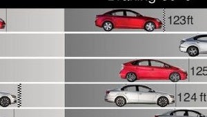
This 123 ft and 124 ft are super close. While the 125 is way out in front of 124. Dafuq?
|
Arch Duke Maxyenko, Shit Talk Extraordinaire
> CalzoneGolem
10/28/2013 at 09:17 |
|
not to mention the times, the lower time is further out?
 505Turbeaux
> Arch Duke Maxyenko, Shit Talk Extraordinaire
505Turbeaux
> Arch Duke Maxyenko, Shit Talk Extraordinaire
10/28/2013 at 09:17 |
|
horrible. Big ups for the TDI though
 Tom McParland
> 505Turbeaux
Tom McParland
> 505Turbeaux
10/28/2013 at 09:20 |
|
I am assuming that TDI is auto-box I wonder with the 6-speed what the numbers would be.
|
505Turbeaux
> Tom McParland
10/28/2013 at 09:41 |
|
better on all counts I am sure
 PelicanHazard
> Arch Duke Maxyenko, Shit Talk Extraordinaire
PelicanHazard
> Arch Duke Maxyenko, Shit Talk Extraordinaire
10/28/2013 at 09:42 |
|
Makes sense to me. Fastest time wins the "race", so it's depicted as being out in front.
|
Tom McParland
> 505Turbeaux
10/28/2013 at 09:43 |
|
I can't wait to see the numbers on the next TDI Sportwagen, especially since they have "added lightness"
|
Arch Duke Maxyenko, Shit Talk Extraordinaire
> PelicanHazard
10/28/2013 at 09:44 |
|
Yeah, but its a lower time. Then the braking is the opposite.
|
505Turbeaux
> Tom McParland
10/28/2013 at 09:46 |
|
they keep adding lightness to that TDI block and injection pump and they are going to grenade more so than they already do. Sad times for the TDI name. BUT for a sweet 50+ MPG wagon, would hoon for the first 125K
|
Tom McParland
> 505Turbeaux
10/28/2013 at 09:48 |
|
I think the motor is the same, but the chassis is lighter by about 200lbs.
|
PelicanHazard
> Arch Duke Maxyenko, Shit Talk Extraordinaire
10/28/2013 at 09:53 |
|
Yes it's a lower time, but in a 0-60 a lower time wins, hence the fastest to 60 being shown in front of the pack as the clear leader. They could have chosen to show fastest 0-60 as the shortest line but didn't. I believe it has to do with how the graphmaker chose the lines.
In the former case, the lines represent something of a distance race, where all the cars start even with each other and a snapshot is taken once the slowest car gets to 60, the assumption being they hold their acceleration constant. Thus, the car that reaches 60 fastest will be ahead of the car that reached 60 2nd fastest, and on and on until the slowest car is at the back. In the latter case, the lines would represent time, where the fastest car has the shortest line.
For braking, of course shortest distance wins, and that is pretty straightforward for a graph.
It makes sense either way it's chosen to be represented.
|
Arch Duke Maxyenko, Shit Talk Extraordinaire
> PelicanHazard
10/28/2013 at 10:00 |
|
no, no, no. The X axis increases as you go to the right, and so for this case, time increasing should follow the same rule.
|
PelicanHazard
> Arch Duke Maxyenko, Shit Talk Extraordinaire
10/28/2013 at 10:02 |
|
And I'm letting you know that Motortrend chose to make the X axis a simplified idealized distance and then labeled the cars with their times.
|
Arch Duke Maxyenko, Shit Talk Extraordinaire
> PelicanHazard
10/28/2013 at 10:03 |
|
Yes, but they have time labeled, not distance. Except for braking, where they got it right.
|
PelicanHazard
> Arch Duke Maxyenko, Shit Talk Extraordinaire
10/28/2013 at 10:08 |
|
That's what I said. They're plotting distance but labeling time, and doing so on purpose.
Pretend it's a dumb drag race, where all the cars accelerate as fast as they can to 60 then hold it until the slowest car gets to 60, at which point a photo is taken. That photo would look very much like their graph, since the car that accelerates to 60 fastest would of course be out front and the slowest in back. Does the graph make sense now?
|
Arch Duke Maxyenko, Shit Talk Extraordinaire
> PelicanHazard
10/28/2013 at 10:10 |
|
No, because it's still improper. You never label one thing and show another.
|
PelicanHazard
> Arch Duke Maxyenko, Shit Talk Extraordinaire
10/28/2013 at 10:15 |
|
Your choice to pick on it, then. I understood the point the graph was trying to get across perfectly well the first time I saw it.
 webmonkees
> Arch Duke Maxyenko, Shit Talk Extraordinaire
webmonkees
> Arch Duke Maxyenko, Shit Talk Extraordinaire
10/28/2013 at 10:28 |
|

I don't know what it means either. I'm using the same chart data.
 DCCARGEEK
> Arch Duke Maxyenko, Shit Talk Extraordinaire
DCCARGEEK
> Arch Duke Maxyenko, Shit Talk Extraordinaire
10/28/2013 at 10:44 |
|
Damn, Corolla must have been so damn good they couldn't even fit it on the chart.
|
Arch Duke Maxyenko, Shit Talk Extraordinaire
> DCCARGEEK
10/28/2013 at 10:47 |
|
So damn grounded.